7 Mobile Responsive WordPress Themes
Making your website mobile responsive is extremely important since googles search algorithm was updated to penalize websites that aren’t mobile responsive. It is alot easier to build your website around a mobile responsive theme rather than convert a website to become mobile responsive. We here at WP Carers have put together this list of 7 Mobile Responsive WordPress Themes to help you to find a suitable theme for your website.
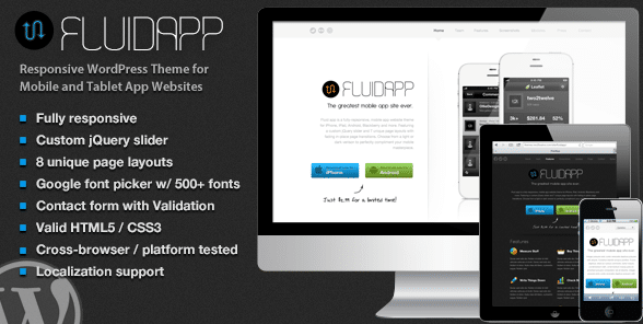
image : themeforest.net
1. FluidApp – Mobile Responsive WordPress Themes
The FluidApp theme was coded using the latest HTML5 and CSS3 standards so it has modern animations and easily resizes to fit any mobile device. FluidApp includes the light and dark version, custom jQuery homepage slider and animations. It also has 8 unique page layouts, screenshot gallery, change-log page, icon picker, blog and real-time Google font picker and much more.
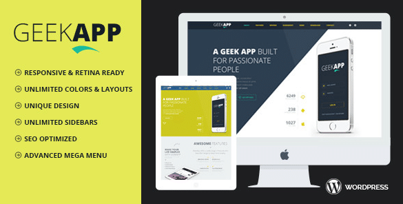
image : themeforest.net
2. GeekApp – Mobile Responsive Themes
GeekApp is a Creative WordPress theme based on bootstrap framework. It is mobile responsive and will resize your website to fit any mobile device seamlessly without taking away from your websites appearance or layout. The theme comes with a shortcode generators so you can customize your website easily to suit your wishes as all files are well commented. It has some cool CSS animations that gives your website a more engaging user experience on your website.
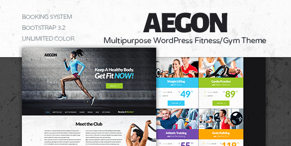
image : themeforest.net
3. Aegon – Responsive WordPress Themes
Aegon is a modern WordPress theme that was designed with Gyms, sports teams and fitness clubs in mind. It can be easily customized for any market whatsoever, also it was 100% mobile responsive design to perfect look on any devices including tablets and IOS devices. Aegon comes with Parallax Backgrounds which will add dept to your website giving it a really professional feel. This theme is also Cross Browser Compatible so you can be sure your users will have no problem viewing your website on all the top pages.
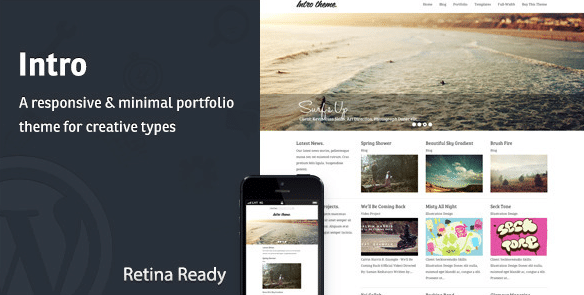
image : themeforest.net
4. Intro – Mobile Responsive WordPress Themes
Intro is a user friendly and Mobile Responsive WordPress Theme that give you the ability to change background colours and images and header and logo image. The theme has a mobile responsive layout that make your website fit any device and you’ll know that any visitor to your website will be having the best experience no matter what device it is they’re using.
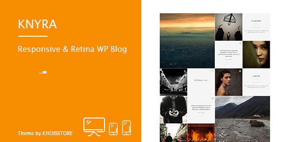
image : themeforest.net
5. Knyra – Mobile Responsive Themes
Knyra is a mobile ready responsive WordPress blog theme that allows you to create a great looking presentation site that fits on any screen sizes. The theme is very user friendly, just select your post format and write your own content and it will be displayed beautifully on front-end. It has been created with SEO in mind using HTML5 and the useful built-in customizer panel inside the theme. This theme is also cross browser compatible and comes with over 500 font awesome icons.
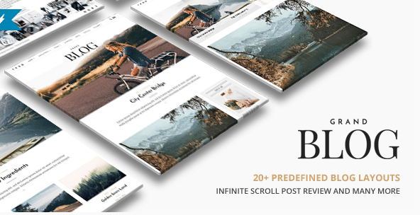
image : themeforest.net
6. Grand Blog – Responsive WordPress Themes
Grand Blog is a clean and minimal WordPress theme for Blog and Magazine web site. Grand Blog supports a responsive layout so it looks great on all devices this feature can be toggles on and off from the back end with a single click. The theme is Retina Ready do your website will be displayed in Ultra-sharp and High Resolution Graphics. It supports the Yoast SEO Plugin which will give your website an advantage when it comes to your search engine rankings.

image : themeforest.net
7. Tectonic – Mobile Responsive WordPress Themes
Tectonic is a responsive WordPress theme suitable for any type of business, services or portfolio website. It’s clean and functional, highly customizable, well structured, and easy to use. And it comes with many great features, some of which are listed below. Tectonic makes it very easy to integrate google maps into your website to save your users from asking for directions.